Opinions on the new SuckleBusters BBQ Sauce labels

Texas Style BBQ Seasonings, Sauces and Such.

Moderator: TBBQF Deputies

Which label design do you like best?

Poll ended at Sat Jun 21, 2008 5:15 pm

Fade
3
18%
Checkered
1
6%
Yellow
12
71%
White
1
6%
 
Total votes: 17
gator USER_AVATAR
Gator
Sheriff
Posts: 6986
Joined: Mon Dec 11, 2006 3:53 pm
Location: Coppell, TX
Contact:

Opinions on the new SuckleBusters BBQ Sauce labels

Postby Gator » Thu Jun 19, 2008 5:15 pm

Howdy,

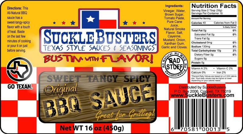
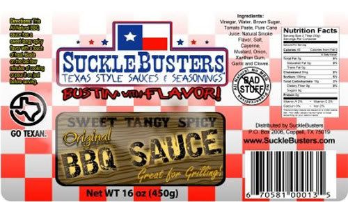
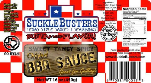
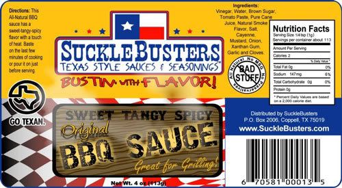
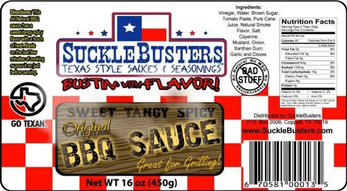
We are getting close on SuckleBusters BBQ Sauce and I am in the final stages of label design:

Fade:
Image

Checkered:
Image

Yellow:
Image

White:
Image
Gator

"I won't tolerate rude behavior" - Woodrow F Call
jamesb USER_AVATAR
JamesB
Retired Lawman
Posts: 6215
Joined: Sun Jan 14, 2007 7:29 am
Location: Irving, Tx
Contact:

Postby JamesB » Thu Jun 19, 2008 5:51 pm

I like the last two... No real reason, they just looked good to me...
Image
bowhnter USER_AVATAR
bowhnter
Chuck Wagon
Posts: 3985
Joined: Mon Mar 26, 2007 1:01 pm
Location: Van Alstyne, TX
Contact:

Postby bowhnter » Thu Jun 19, 2008 6:03 pm

Either of the bottom two, except I would pick yellow because that goes with all the rest of your labels....kind of a Sucklebuster tardemark 8)
Mike

Primo Oval XL
Grilla Silverbac
Weber 26”, 22”, and Jumbo Joe
Weber Genesis
Ooni Pro Pizza oven
Blackstone 22 and 36
datsbbq USER_AVATAR
DATsBBQ
Deputy
Posts: 8151
Joined: Sat Jan 13, 2007 11:15 am
Location: Yorktown, VA
Contact:

Postby DATsBBQ » Thu Jun 19, 2008 6:14 pm

They kind of made dizzy. Maybe seeing 'em on a bottle would make it easier. That or I could change the resolution of my monitor but then I couldn't read any of the text :shock:
Deputy Dave

“A wise man can learn more from a foolish question than a fool can learn from a wise answer."-Bruce Lee
harvestmoon USER_AVATAR
HarvestMoon
Outlaw
Posts: 1549
Joined: Sat Jun 14, 2008 5:18 pm
Location: Piney woods north of Beaumont, Texas
Contact:

Postby HarvestMoon » Thu Jun 19, 2008 6:28 pm

The yellow label was easier to read.
gator USER_AVATAR
Gator
Sheriff
Posts: 6986
Joined: Mon Dec 11, 2006 3:53 pm
Location: Coppell, TX
Contact:

Postby Gator » Thu Jun 19, 2008 6:36 pm

DATsBBQ wrote:They kind of made dizzy. Maybe seeing 'em on a bottle would make it easier. That or I could change the resolution of my monitor but then I couldn't read any of the text :shock:


Point noted. Just testing the overall look here, once I pick a version to go with - I have to go back and work on the details. :wink:
Gator

"I won't tolerate rude behavior" - Woodrow F Call
nascarchuck USER_AVATAR
nascarchuck
Retired Lawman
Posts: 4677
Joined: Sat Jan 13, 2007 11:34 pm
Location: Ft. Worth, Texas
Contact:

Postby nascarchuck » Thu Jun 19, 2008 8:46 pm

I like the yellow then the fade.
Chuck

http://cookinwithchuck.blogspot.com - Updated 01/10/10

Image
steercrazy USER_AVATAR
SteerCrazy
Retired Lawman
Posts: 2656
Joined: Sat Jan 13, 2007 10:33 am
Location: Kansas City
Contact:

Postby SteerCrazy » Thu Jun 19, 2008 8:48 pm

I really like the first one Gator. They all look good!
gator USER_AVATAR
Gator
Sheriff
Posts: 6986
Joined: Mon Dec 11, 2006 3:53 pm
Location: Coppell, TX
Contact:

Postby Gator » Fri Jun 20, 2008 7:07 am

OK - how about this (kind of a combination of the last 2):

Image
Last edited by Gator on Fri Jun 20, 2008 8:29 am, edited 1 time in total.
Gator

"I won't tolerate rude behavior" - Woodrow F Call
steercrazy USER_AVATAR
SteerCrazy
Retired Lawman
Posts: 2656
Joined: Sat Jan 13, 2007 10:33 am
Location: Kansas City
Contact:

Postby SteerCrazy » Fri Jun 20, 2008 7:33 am

that's a nice lookin label Gator
ikiru USER_AVATAR
ikiru
Wrangler
Posts: 92
Joined: Sat Aug 18, 2007 2:51 pm
Location: DFW
Contact:

Postby ikiru » Fri Jun 20, 2008 8:46 am

I like the yellow, but I think you need to find space to put:

Warning: This sauce has been known to cause mouth watering, intense satisfaction, culinary superiority, and the occasional DAAAAAAAAAAAMN!!!!

Good stuff!

:thap:

-ikiru

*enjoy the sauce*
txngent USER_AVATAR
txngent
Bandolero
Posts: 614
Joined: Sat Apr 12, 2008 9:43 pm
Location: Conroe, TX.
Contact:

Postby txngent » Fri Jun 20, 2008 9:05 am

I voted Yellow. Advertising study shows people recognize image over name out of a crowd. I like how your labels are all consistant in base images. As a cook, I like how I can grab your product out of maybe 35 other spices in my spice cabinet without really looking.

Oh, guess it also helps since yours are right in front! :twisted:
One Backwoods Fatboy, One Traeger Texas Grill, just looking for a trailer!
Randy
datsbbq USER_AVATAR
DATsBBQ
Deputy
Posts: 8151
Joined: Sat Jan 13, 2007 11:15 am
Location: Yorktown, VA
Contact:

Postby DATsBBQ » Fri Jun 20, 2008 9:07 am

SteerCrazy wrote:I really like the first one Gator. They all look good!


Ok, looked at them again with rested eyes and I agree with SC in that I like the first one best and they look like winners to me. 8)
Deputy Dave

“A wise man can learn more from a foolish question than a fool can learn from a wise answer."-Bruce Lee
bowhnter USER_AVATAR
bowhnter
Chuck Wagon
Posts: 3985
Joined: Mon Mar 26, 2007 1:01 pm
Location: Van Alstyne, TX
Contact:

Postby bowhnter » Fri Jun 20, 2008 9:16 am

I do think it should be yellow to stay consistant, and I do like the combo you just came up with !
Mike

Primo Oval XL
Grilla Silverbac
Weber 26”, 22”, and Jumbo Joe
Weber Genesis
Ooni Pro Pizza oven
Blackstone 22 and 36
papa tom USER_AVATAR
Papa Tom
Deputy
Posts: 6774
Joined: Sat Jun 30, 2007 9:40 am
Location: Oak Point, TX
Contact:

Postby Papa Tom » Fri Jun 20, 2008 9:24 am

I agree with those favoring yellow for brand recognition......
tarde venientibus ossa....

Return to “SuckleBusters - The Forum Sponsor”

Who is online

Users browsing this forum: No registered users and 76 guests